I still get thrown back when training junior designers and realize that many have not been taught the fundamental principles of typography hierarchy. As I remember, it was not the most exciting class in school at least compared to the fun classes that allowed for experimentation with digital tools such as Photoshop and Illustrator. Ultimately it was the inherent challenge of solving the visual problem that helped me respect typography and its power. It wasn’t until I started out in my career that the knowledge really paid dividends. Corporate design or conservative design such as in the financial and legal area that tend to be text heavy, rely on the designer to be a master of typography and to control the readers eye flow by developing the path via hierarchy. Here are some of the basic ways you can use to create a typography hierarchy and to make text heavy pieces more legible and important information seen first.
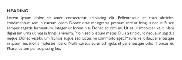
1. Weight
The first and basic option is by changing the weight of a font (bold, semi-bold, thin) that will help create distinction. Ultimately it’s the variances that trigger the focus of the eye such as the use of positive and negative created by the weight of the font.
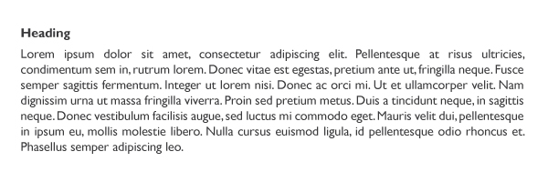
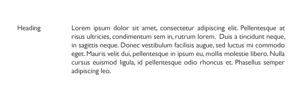
2. Font family
The general rule of thumb is to use only two typefaces in a project – Serif and sans serif. Of course rules are not set in stone and depending on the art piece it may require more than one to illustrate a point or to communicate an emotion. By using a sans serif for the header and a serif for the body text we can create a noticeable contrast.
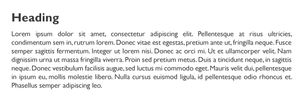
3. Size
Probably the one most used to create distinction.
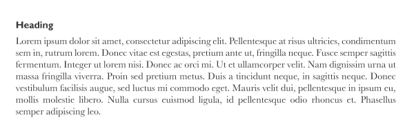
4. Space
Using space can be fun but can also be very challenging depending on the level of complexity. If the pieces are too far apart the flow might be lost but if done correctly it can create some amazing dynamics.
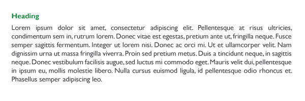
5. Colour
Colour is a powerful tool when added into the mix.
6. Letter Case
This can include upper case and lower case to create contrast. Using mixed cases in the same word can also be utilized but be mindful as it can cause visual strain if not implemented correctly.